----------------------------------------------------------
Multi-line graph with automatic legend and toggling show / hide lines.
Purpose
Creating a multi-line graph is a pretty handy thing to be able to do and we worked through an example earlier in the book as an extension of our simple graph. In that example we used a csv file that had the data arranged with each lines values in a separate column.
date,close,open
1-May-12,68.13,34.12
30-Apr-12,63.98,45.56
27-Apr-12,67.00,67.89
26-Apr-12,89.70,78.54
25-Apr-12,99.00,89.23
24-Apr-12,130.28,99.23
23-Apr-12,166.70,101.34
This is a common way to have data stored, but if you are retrieving information from a database, you may not have the luxury of having it laid out in columns. It may be presented in a more linear fashion where each lines values are stores on a unique row with the identifier for the line on the same row. For instance, the data above could just as easily be presented as follows;
price,date,value
close,1-May-12,68.13
close,30-Apr-12,63.98
close,27-Apr-12,67.00
close,26-Apr-12,89.70
close,25-Apr-12,99.00
close,24-Apr-12,130.28
close,23-Apr-12,166.70
open,1-May-12,34.12
open,30-Apr-12,45.56
open,27-Apr-12,67.89
open,26-Apr-12,78.54
open,25-Apr-12,89.23
open,24-Apr-12,99.23
open,23-Apr-12,101.34
In this case, we would need to ‘pivot’ the data to produce the same multi-column representation as the original format. This is not always easy, but it can be achieved using the d3
nest function which we will examine.
As well as this we will want to automatically encode the lines to make them different colours and to add a legend with the line name and the colour of the appropriate line.
Finally, because we will build a graph script that can cope with any number of lines (within reason), we will need to be able to show / hide the individual lines to try and clarify the graph if it gets too cluttered.
All of these features have been covered individually in the book, so what we’re going to do is combine them in a way that presents us with an elegant multi-line graph that looks a bit like this;
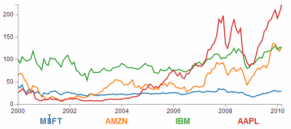 |
| Multi-line graph with legend |
The Code
The following is the code for the initial example which is a slight derivative of the original simple graph. A live version is available online at bl.ocks.org or GitHub. It is also available as the files ‘super-multi-lines.html’ and ‘stocks.csv’ as a download with the book D3 Tips and Tricks (in a zip file) when you download the book from Leanpub.
<!DOCTYPE html><metacharset="utf-8"><style>/* set the CSS */body{font:12pxArial;}path{stroke:steelblue;stroke-width:2;fill:none;}.axispath,.axisline{fill:none;stroke:grey;stroke-width:1;shape-rendering:crispEdges;}</style><body><!-- load the d3.js library --><scriptsrc="http://d3js.org/d3.v3.min.js"></script><script>// Set the dimensions of the canvas / graphvarmargin={top:30,right:20,bottom:30,left:50},width=600-margin.left-margin.right,height=270-margin.top-margin.bottom;// Parse the date / timevarparseDate=d3.time.format("%b %Y").parse;// Set the rangesvarx=d3.time.scale().range([0,width]);vary=d3.scale.linear().range([height,0]);// Define the axesvarxAxis=d3.svg.axis().scale(x).orient("bottom").ticks(5);varyAxis=d3.svg.axis().scale(y).orient("left").ticks(5);// Define the linevarpriceline=d3.svg.line().x(function(d){returnx(d.date);}).y(function(d){returny(d.price);});// Adds the svg canvasvarsvg=d3.select("body").append("svg").attr("width",width+margin.left+margin.right).attr("height",height+margin.top+margin.bottom).append("g").attr("transform","translate("+margin.left+","+margin.top+")");// Get the datad3.csv("stocks.csv",function(error,data){data.forEach(function(d){d.date=parseDate(d.date);d.price=+d.price;});// Scale the range of the datax.domain(d3.extent(data,function(d){returnd.date;}));y.domain([0,d3.max(data,function(d){returnd.price;})]);// Nest the entries by symbolvardataNest=d3.nest().key(function(d){returnd.symbol;}).entries(data);// Loop through each symbol / keydataNest.forEach(function(d){svg.append("path").attr("class","line").attr("d",priceline(d.values));});// Add the X Axissvg.append("g").attr("class","x axis").attr("transform","translate(0,"+height+")").call(xAxis);// Add the Y Axissvg.append("g").attr("class","y axis").call(yAxis);});</script></body>
Description
NESTING THE DATA
The example code above differs from the simple graph in two main ways.
Firstly, the script loads the file
stocks.csv which was used by Mike Bostock in his small multiples example. This means that the variable names used are different (price for the value of the stocks, symbol for the name of the stock and good old date for the date) and we have to adjust the parseDate function to parse a modifed date value.
Secondly we add the code blocks to take the
stocks.csv information that we load as data and we apply thed3.nest function to it and draw each line.
The following code nest’s the data
vardataNest=d3.nest().key(function(d){returnd.symbol;}).entries(data);
We declare our new array’s name as
dataNest and we initiate the nest function;vardataNest=d3.nest()
We assign the
key for our new array as symbol. A ‘key’ is like a way of saying “This is the thing we will be grouping on”. In other words our resultant array will have a single entry for each unique symbol or stock which will itself be an array of dates and values..key(function(d){returnd.symbol;})
Then we tell the nest function which data array we will be using for our source of data.
}).entries(data);
Then we use the nested data to loop through our stocks and draw the lines
dataNest.forEach(function(d){svg.append("path").attr("class","line").attr("d",priceline(d.values));});
The
forEach function being applied to dataNest means that it will take each of the keys that we have just declared with the d3.nest (each stock) and use the values for each stock to append a line using its values.
The end result looks like the following;
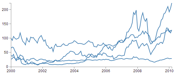 |
| A very plain multi-line graph |
You would be justified in thinking that this is more than a little confusing. Clearly while we have been successful in making each stock draw a corresponding line, unless we can tell them apart, the graph is pretty useless.
APPLYING THE COLOURS
Making sure that the colours that are applied to our lines (and ultimately our legend text) is unique from line to line is actually pretty easy.
The code that we will implement for this change is available online at bl.ocks.org or GitHub. It is also available as the files ‘super-multi-colours.html’ and ‘stocks.csv’ as a download with the book D3 Tips and Tricks (in a zip file) when you download the book from Leanpub.
The changes that we will make to our code are captured in the following code snippet.
varcolor=d3.scale.category10();// Loop through each symbol / keydataNest.forEach(function(d){svg.append("path").attr("class","line").style("stroke",function(){returnd.color=color(d.key);}).attr("d",priceline(d.values));});
Firstly we need to declare an ordinal scale for our colours with
var color = d3.scale.category10();. This is a set of categorical colours (10 of them in this case) that can be invoked which are a nice mix of difference from each other and pleasant on the eye.
We then use the colour scale to assign a unique stroke (line colour) for each unique key (symbol) in our dataset.
.style("stroke",function(){returnd.color=color(d.key);})
It seems easy when it’s implemented, but in all reality, it is the product of some very clever thinking behind the scenes when designing d3.js and even picking the colours that are used. The end result is a far more usable graph of the stock prices.
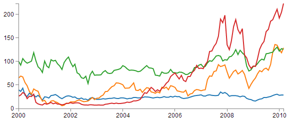 |
| Multi-line graph with unique colours |
Of course now we’re faced with the problem of not knowing which line represents which stock price. Time for a legend.
ADDING THE LEGEND
If we think about the process of adding a legend to our graph, what we’re trying to achieve is to take every unique data series we have (stock) and add a relevant label showing which colour relates to which stock. At the same time, we need to arrange the labels in such a way that they are presented in a manner that is not offensive to the eye. In the example I will go through I have chosen to arrange them neatly spaced along the bottom of the graph. so that the final result looks like the following;
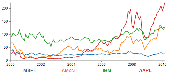 |
| Multi-line graph with legend |
Bear in mind that the end result will align the legend completely automatically. If there are three stocks it will be equally spaced, if it is six stocks they will be equally spaced. The following is a reasonable mechanism to facilitate this, but if the labels for the data values are of radically different lengths, the final result will looks ‘odd’ likewise, if there are a LOT of data values, the legend will start to get crowded.
The code that we will implement for this change is available online at bl.ocks.org or GitHub. It is also available as the files ‘super-multi-legend.html’ and ‘stocks.csv’ as a download with the book D3 Tips and Tricks (in a zip file) when you download the book from Leanpub.
There are three broad categories of changes that we will want to make to our current code;
- Declare a style for the legend font
- Change the area and margins for the graph to accommodate the additional text
- Add the text
Declaring the style for the legend text is as easy as making an appropriate entry in the
<style> section of the code. For this example I have chosen the following;.legend{font-size:16px;font-weight:bold;text-anchor:middle;}
To change the area and margins of the graph we can make the following small changes to the code.
varmargin={top:30,right:20,bottom:70,left:50},width=600-margin.left-margin.right,height=300-margin.top-margin.bottom;
The bottom margin is now 70 pixels high and the overall space for the area that the graph (including the margins) covers is increased to 300 pixels.
To add the legend text is slightly more work, but only slightly more. The following code incorporates the changes and I have placed commented out asterisks to the end of the lines that have been added
legendSpace=width/dataNest.length;// spacing for legend // ******// Loop through each symbol / keydataNest.forEach(function(d,i){// ******svg.append("path").attr("class","line").style("stroke",function(){// Add the colours dynamicallyreturnd.color=color(d.key);}).attr("d",priceline(d.values));// Add the Legendsvg.append("text")// *******.attr("x",(legendSpace/2)+i*legendSpace)// spacing // ****.attr("y",height+(margin.bottom/2)+5)// *******.attr("class","legend")// style the legend // *******.style("fill",function(){// dynamic colours // *******returnd.color=color(d.key);})// *******.text(d.key);// *******});
The first added line finds the spacing between each legend label by dividing the width of the graph area by the number of symbols (
key’s or stocks).legendSpace=width/dataNest.length;
Then there is a small and subtle change that might other wise go unnoticed, but is nonetheless significant. We add an
i to the forEach function;dataNest.forEach(function(d,i){
This might not seem like much of a big deal, but declaring
i allows us to access the index of the returned data. This means that each unique key (stock or symbol) has a unique number. In our example those numbers would be from 0 to 3 (MSFT = 0, AMZN = 1, IBM = 2 and AAPL = 3 (this is the order in which the stocks appear in our csv file)).
Now we get to adding our text. Again, this is a fairly simple exercise which is following the route that we have taken several times already in the book but using some of our prepared values.
svg.append("text").attr("x",(legendSpace/2)+i*legendSpace).attr("y",height+(margin.bottom/2)+5).attr("class","legend").style("fill",function(){returnd.color=color(d.key);}).text(d.key);
The horizontal spacing for the labels is achieved by setting each label to the position set by the index associated with the label and the space available on the graph. To make it work out nicely we add half a
legendSpace at the start (legendSpace/2) and then add the product of the index (i) and legendSpace(i*legendSpace).
We position the legend vertically so that it is in the middle of the bottom margin (
height + (margin.bottom/2)+ 5).
And we apply the same colour function to the text as we did to the lines earlier;
.style("fill",function(){returnd.color=color(d.key);})
The final result is a neat and tidy legend at the bottom of the graph;
|
| Multi-line graph with legend |
If you’re looking for an exercise to test your skills you could adapt the code to show the legend to the right of the graph. And if you wanted to go one better, you could arrange the order of the legend to reflect the final numeric value on the right of the graph (I.e in this case AAPL would be on the top and MSFT on the bottom).
MAKING IT INTERACTIVE
The last step we’ll take in this example is to provide ourselves with a bit of control over how the graph looks. Even with the multiple colours, the graph could still be said to be ‘busy’. To clean it up or at least to provide the ability to more clearly display the data that a user wants to see we will add code that will allow us to click on a legend label and this will toggle the corresponding graph line on or off.
This is a progression from the example of how to show / hide an element by clicking on another element that was introduced in he ‘Assorted tips and tricks’ chapter.
The only changes to our code that need to be implemented are in the
forEach section below. I have left some comments with asterisks in the code below to illustrate lines that are added.dataNest.forEach(function(d,i){svg.append("path").attr("class","line").style("stroke",function(){returnd.color=color(d.key);}).attr("id",'tag'+d.key.replace(/\s+/g,''))// assign ID **.attr("d",priceline(d.values));// Add the Legendsvg.append("text").attr("x",(legendSpace/2)+i*legendSpace).attr("y",height+(margin.bottom/2)+5).attr("class","legend").style("fill",function(){returnd.color=color(d.key);}).on("click",function(){// ************// Determine if current line is visiblevaractive=d.active?false:true,// ************newOpacity=active?0:1;// ************// Hide or show the elements based on the IDd3.select("#tag"+d.key.replace(/\s+/g,''))// *********.transition().duration(100)// ************.style("opacity",newOpacity);// ************// Update whether or not the elements are actived.active=active;// ************})// ************.text(d.key);});
The full code for the complete working example is available online at bl.ocks.org or GitHub. It is also available as the files ‘super-multi.html’ and ‘stocks.csv’ as a download with the book D3 Tips and Tricks (in a zip file) when you download the book from Leanpub.
The first piece of code that wee need to add assign an
id to each legend text label..attr("id",'tag'+d.key.replace(/\s+/g,''))
Being able to use our
key value as the id means that each label will have a unique identifier. “What’s with adding the 'tag' piece of text to the id?” I hear you ask. Good question. If our key starts with a number we could strike trouble (in fact I’m sure there are plenty of other ways we could strike trouble too, but this was one I came accross). As well as that we include a little regular expression goodness to strip any spaces out of the key with .replace(/\s+/g, '').
The
.replace calls the regular expression action on our key. \s is the regex for “whitespace”, andg is the “global” flag, meaning match ALL \s (whitespaces). The + allows for any contiguous string of space characters to being replaced with the empty string (''). This was a late addition to the example and kudos go to the participants in the Stack Overflow question here. |
Then we use the
.on("click", function(){ call carry out some actions on the label if it is clicked on. We toggle the .active descriptor for our element with var active = d.active ? false : true,. Then we set the value ofnewOpacity to either 0 or 1 depending on whether active is false or true.
From here we can select our lable using its uinque id and adjust it’s opacity to either
0 (transparent) or 1(opaque);d3.select("#tag"+d.key.replace(/\s+/g,'')).transition().duration(100).style("opacity",newOpacity);
Just because we can, we also add in a
transition statement so that the change in transparency doesn't occur in a flash (100 milli seconds in fact (.duration(100))).
Lastly we update our
d.active variable to whatever the active state is so that it can toggle correctly the next time it is clicked on.
Head on over to the live example on bl.ocks.org to see the toggling awesomeness that could be yours!